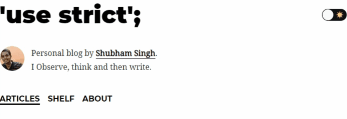
The very first thing that I really liked about Dan Abramov’s blog is the dark-light mode toggle. Firstly, because it’s a fun little thing to have both for developers and for their readers and Secondly, implementing the toggle is not that straight forward as it may seem in a Gatsby blog.
So, with this post, my aim is to explain “how I” (to be honest - “how Dan”) implemented the toggle.
Goals
- Add a toggle switch/button to change the theme between dark mode or light mode. I used the
react-togglelibrary for that. It’s open source (Kudos to it’s contributors!) and I’ll provide a link to the github repo at the end of this post. - We’ll also persist the reader’s preference inside of browser’s
localstorageso they don’t have to toggle everytime they re-visit our site. - Use Gatsby’s
default-html.jsto inject our javascript when our website loads.
A side note
There are few other ways to implement dark mode in gatsby and one such way is by using Gatsby’s inbuilt dark mode plugin (link at the end). But what we’ll be doing in this post is to basically use gatsby’s default-html.js to inject our javascript which will essentially add a css class ('dark' or 'light') to our body element, we’ll then colour our website’s background and text according to the class. Now, you may also use gatsby-ssr.js to add your custom script but I’m going to go old school and use default-html.js to do the same instead. And don’t worry, I’ll add some more references at the end of post if you wish to try doing it the other way.
Implementation
- Copy the
default-html.jsfile at.cache/default-html.jsinside yoursrcdirectory and rename it ashtml.js. - We’ll then add a script inside of the
html.jsfile we just created, which will do the magic of adding the appropriate css class -'dark'or'light'in html body when our website is loaded for the first time.
//html.js
import React from "react";
import PropTypes from "prop-types";

export default function HTML(props) {
  return (
    <html {...props.htmlAttributes}>
      <head>
        <meta charSet="utf-8" />
        <meta httpEquiv="x-ua-compatible" content="ie=edge" />
        <meta
          name="viewport"
          content="width=device-width, initial-scale=1, shrink-to-fit=no"
        />
        {props.headComponents}
      </head>
      <body {...props.bodyAttributes} className="light">
        <script
          dangerouslySetInnerHTML={{
            __html: `
          (function() {
            window.__onThemeChange = function() {};
            function setTheme(newTheme) {
              window.__theme = newTheme;
              preferredTheme = newTheme;
              document.body.className = newTheme;
              window.__onThemeChange(newTheme);
            }

            var preferredTheme;
            try {
              preferredTheme = localStorage.getItem('theme');
            } catch (err) { }

            window.__setPreferredTheme = function(newTheme) {
              setTheme(newTheme);
              try {
                localStorage.setItem('theme', newTheme);
              } catch (err) {}
            }

            var darkQuery =
                 window.matchMedia('(prefers-color-scheme: dark)');
            darkQuery.addListener(function(e) {
              window.__setPreferredTheme(e.matches ?
                                         'dark' : 'light')
            });

            setTheme(preferredTheme || (darkQuery.matches ?
                                        'dark' : 'light'));
          })();
          `,
          }}
        />
        {props.preBodyComponents}
        <div
          key={`body`}
          id="___gatsby"
          dangerouslySetInnerHTML={{ __html: props.body }}
        />
        {props.postBodyComponents}
      </body>
    </html>
  );
}
The only thing we have added to the existing (code) in default-html.js is our script tag and the code inside of it. And needless to say that we have to use dangerouslySetInnerHTML to do so because, well, that’s the React way!
The setTheme function’s main reponsibility is to apply an appropriate class to the html body.
- Below is the css which we’ll use for the color change to actually take effect (offcourse we haven’t yet added our toggle switch which will trigger the changes.)
body {
  --blk: rgb(0, 0, 0);
  --blu: #007acc;
  background-color: var(--bg);
}

body.light {
  --bg: #ffffff;
  --bg-secondary: rgb(249, 250, 251);
  --header: var(--blk);
  --textNormal: #222;
  --textTitle: #222;
  --textLink: var(--blk);
}

body.dark {
  -webkit-font-smoothing: antialiased;
  --bg: #282c35;
  --bg-secondary: rgb(54, 60, 72);
  --header: #ffffff;
  --textNormal: rgba(255, 255, 255, 0.88);
  --textTitle: #ffffff;
  --textLink: var(--blu);
}
The most important thing to note in the css is that we are using css variables and more importantly the background color for body is background-color: var(--bg); where, as you can see, the --bg variable changes with the current css class in effect.
- Next, we’ll use the
react-togglelibrary to add the toggle switch. I’ll add the link to it’s github repo where you can get the code and css for the same. I added this component inside of mylayout.jsfile which usually is provided out of the box if you’re using a starter.
<Toggle
  icons={{
    checked: (
      <img
        src={moon}
        alt="moon"
        width="16"
        height="16"
        role="presentation"
        style={{ pointerEvents: "none" }}
      />
    ),
    unchecked: (
      <img
        src={sun}
        alt="sun"
        width="16"
        height="16"
        role="presentation"
        style={{ pointerEvents: "none" }}
      />
    ),
  }}
  checked={theme === "dark"}
  onChange={e =>
    window.__setPreferredTheme(e.target.checked ? "dark" : "light")
  }
/>
We’ll then use react-hooks to save and update the state.
const [theme, setTheme] = useState(null);

useEffect(() => {
  setTheme(window.__theme);
  window.__onThemeChange = () => {
    setTheme(window.__theme);
  };
}, []);
Okay, so a lot going on here. Let me try to explain these step by step.
Firstly, note that the useEffect hook is passed [] as second argument and therefore it’ll be called only once after the first render of the component i.e when the component mounts. So, after the very first render we add the current theme to the state using the setTheme function. We’ve also defined the __onThemeChange method inside of the hook, but I’ll come to it in a while.
Finally, once we have our toggle switch in place, anytime someone toggles it, the callback associated with the onchange is called. This callback in turn calls the __setPreferredTheme method, which - if you remember, we had already declared in the very first step while injecting our javascript (Feel free to scroll up and find the method). __setPrefferedTheme calls setTheme function which, as I already mentioned adds appropriate class ('dark' or 'light') to the body and in addition also calls the __onThemeChange, which like I metioned is defined inside of the useEffect hook in the component and does a simple job of updating the state everytime we toggle the switch between dark and light.
And that’s pretty much it! We should now have a working dark-light mode toggle added to our website. Ofcourse you could play around and tweak as per your need but I guess this much should be good to give you a sense to get started!
I hope you enjoyed this short post and that it helps you in some way or the other. Do let me know your thoughts in the comments.
And as always - Thanks for reading!